the journal
How to balance wall art?
A common question I often get from my clients is what size of portrait they should hang over their sofa, mantle, or other furniture pieces. The key is to choose a portrait size that is proportional to the furniture/architectural element it will be hung above.
Hanging artwork can be a fun way to add personality to any space, but it’s important to follow a few key guidelines to get the look just right. First and foremost, aim to have the center of the artwork at eye-level, around 57-60 inches from the floor. This ensures the piece is comfortably viewable for most people.
Next, leave about 8 inches of space between the top of any furniture, like a sofa or console table, and the bottom of the artwork. This proportional spacing creates a cohesive, balanced feel in the room.
Lastly, consider the size of the artwork in relation to the furniture below it. The overall width of the artwork should be 1/2 to 2/3 the width of the furniture. Artwork that is too small will look lost, while oversized pieces can overwhelm the space.
By keeping these three tips in mind, you can easily elevate your space with stylish, well-placed artwork. It may take a little trial and error, but the end result will be a polished, designer-approved look you’ll love coming home to.


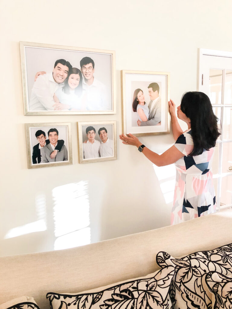
I wanted to create a warm, inviting gallery wall that showcased their cherished family portraits. First, I positioned the largest piece, their family portrait in the center. This became the anchor for the arrangement.
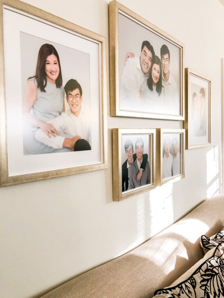
To the left and right of the central piece, I hung two medium pieces. Then, to fill out the gallery, I added smaller photos. I placed the two smaller frames horizontally to create an organic, artful look. I spaced these about 8 inches from the top of their living room sofa, maintaining that ideal proportion. The overall width of the gallery ended up being about 2/3 the length of the sofa below.

The result is a beautifully curated wall display that feels cohesive and balanced. Each piece complements the others, and the spacing and sizing create a polished, designer-approved aesthetic. Most importantly, every time the family walks by, they’re greeted by cherished memories of their family.